By: Evelyn Wilson • DIY & Crafts
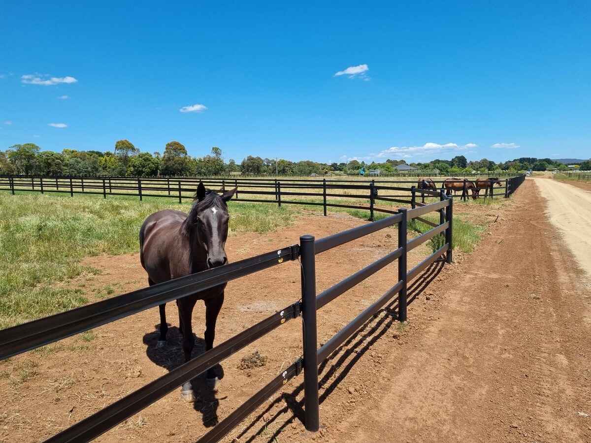
How To Build A Horse Fence
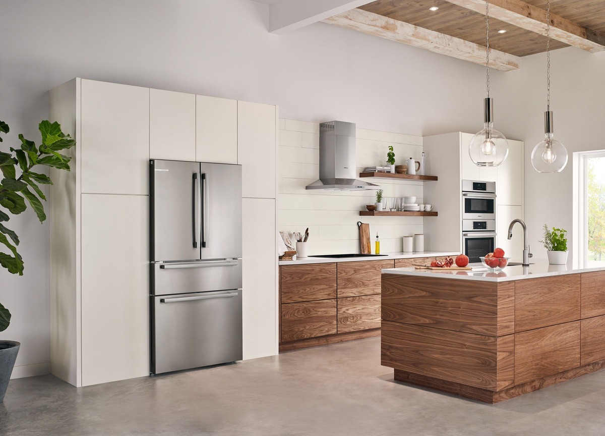
By: Harper Martinez • DIY & Crafts
How To Build A Refrigerator Cabinet
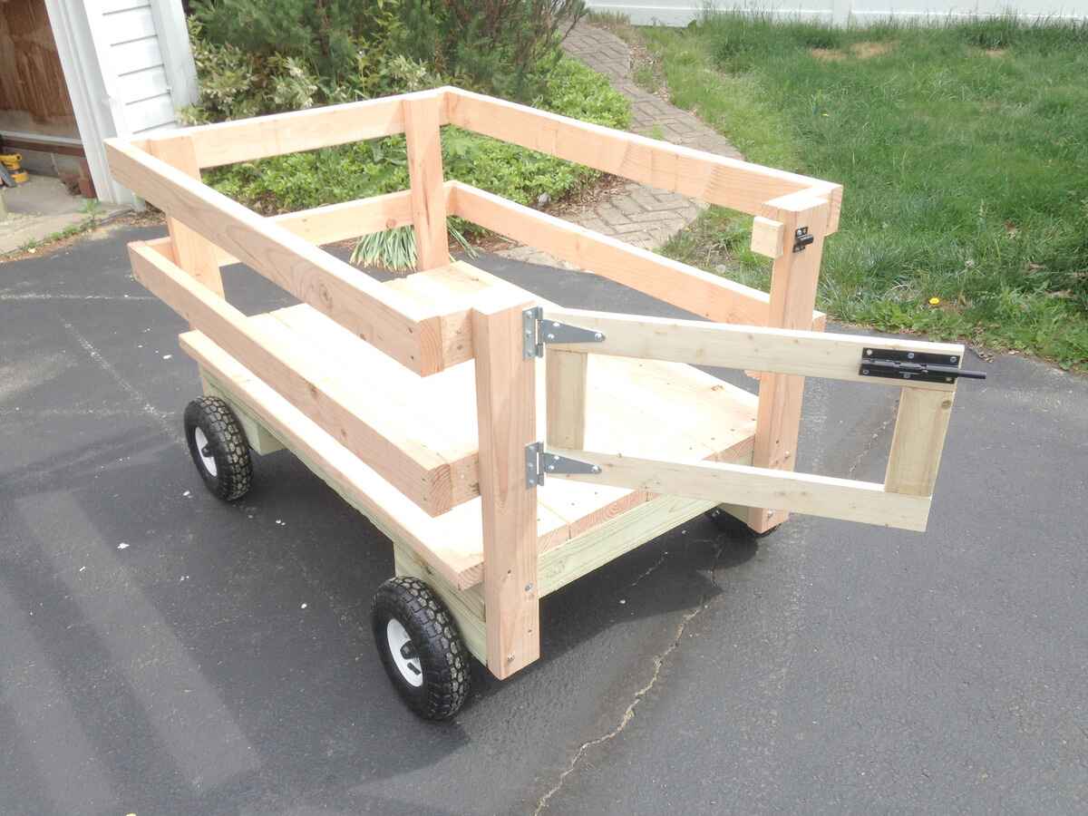
By: Harper Martinez • DIY & Crafts
DIY Wagon: How To Build Your Own Customized Cart
DIY & Crafts
DIY & Crafts
DIY & Crafts
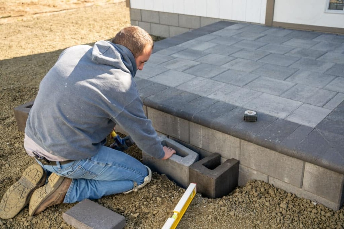
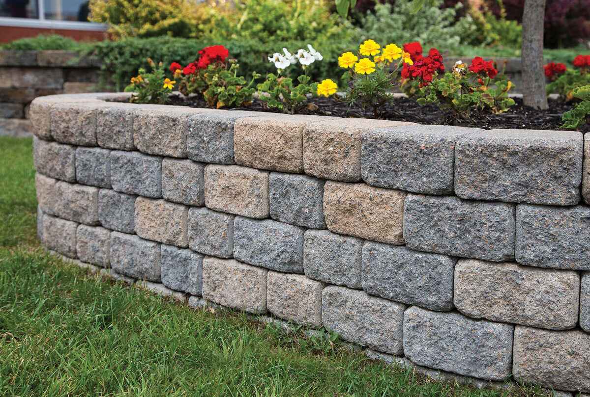
Masonry & Tilework
Electrical & Wiring
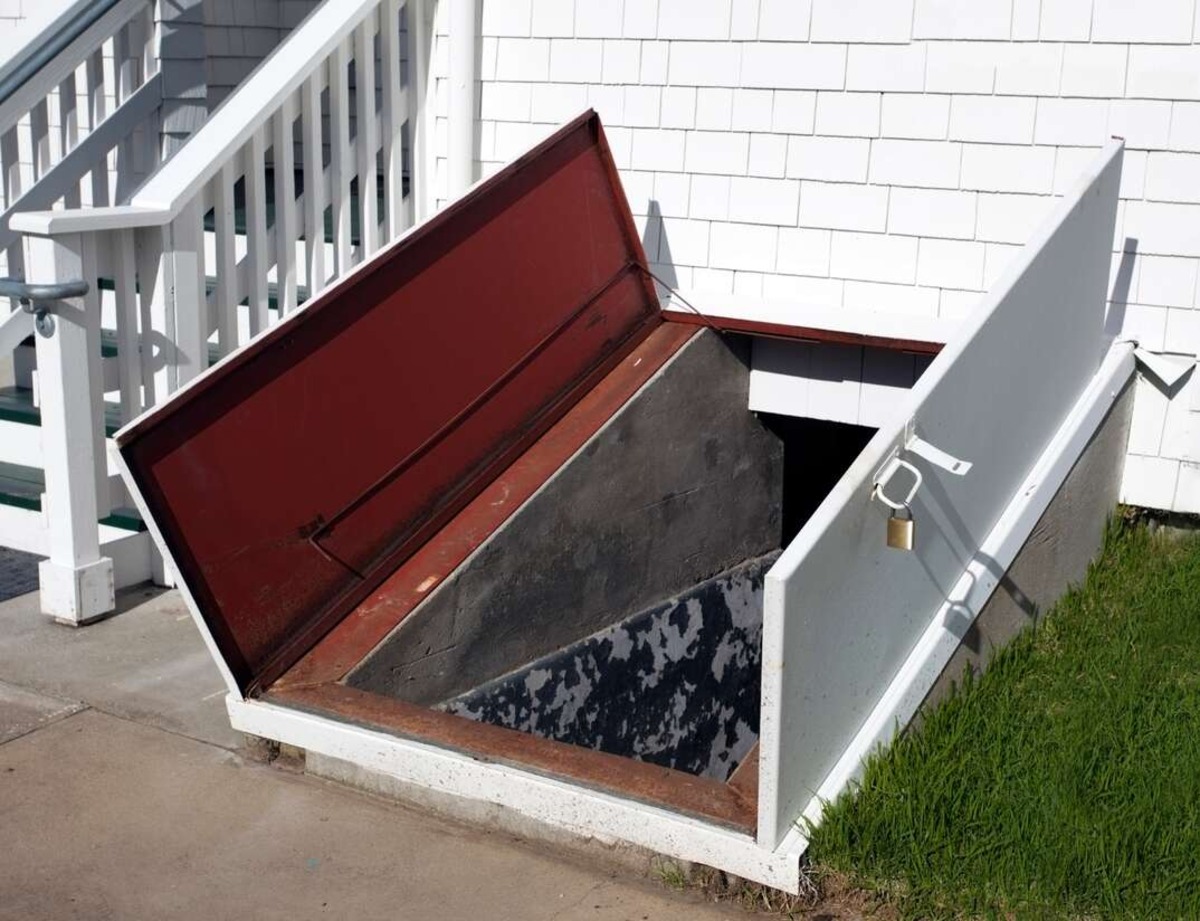
Garage & Basement
DIY & Crafts
DIY & Crafts
DIY & Crafts
DIY & Crafts
DIY & Crafts
Inspiration & Ideas
Featured Articles
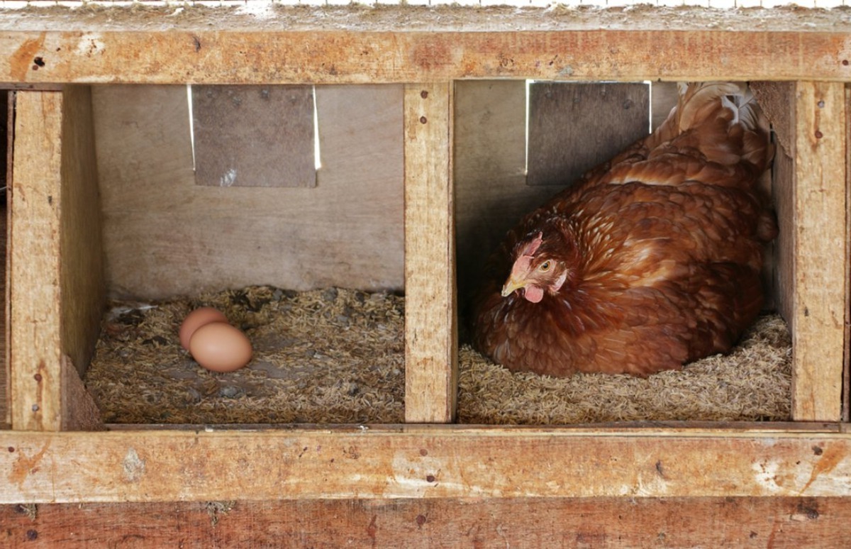
By: Evelyn Wilson • DIY & Crafts
How To Build Chicken Nesting Boxes
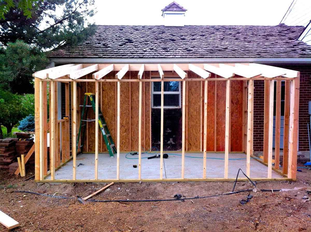
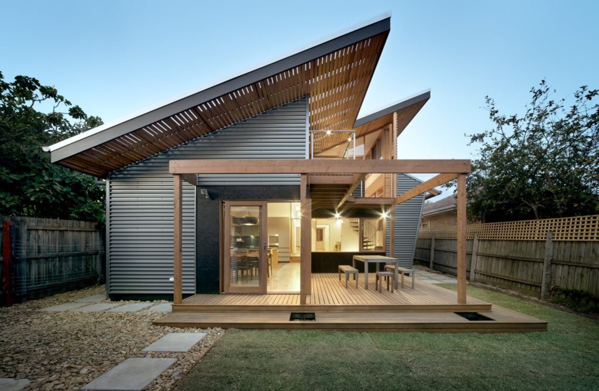
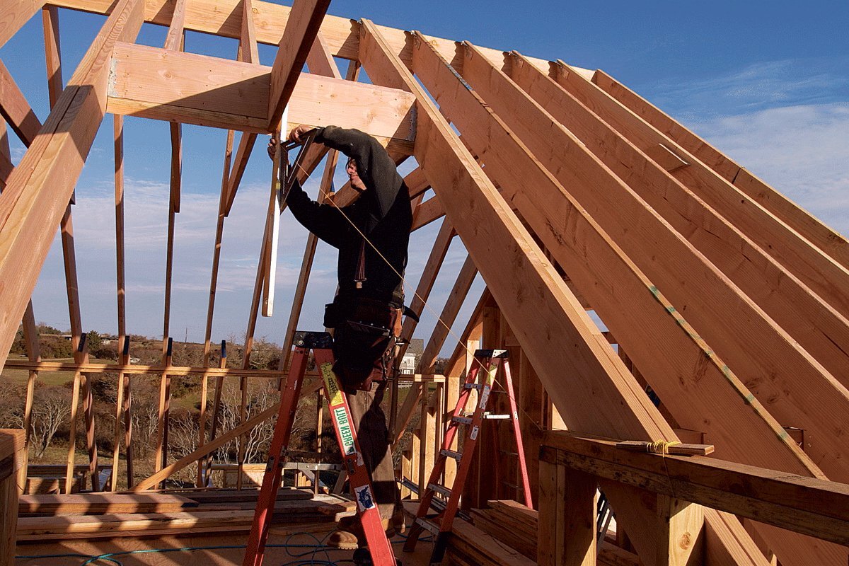
By: Harper Martinez • Roof
DIY Shed Roof Framing: Step-by-Step Guide For Building A Sturdy Structure
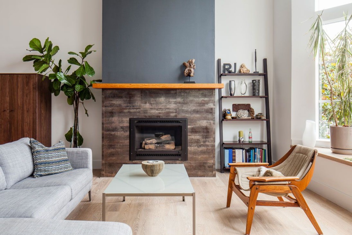
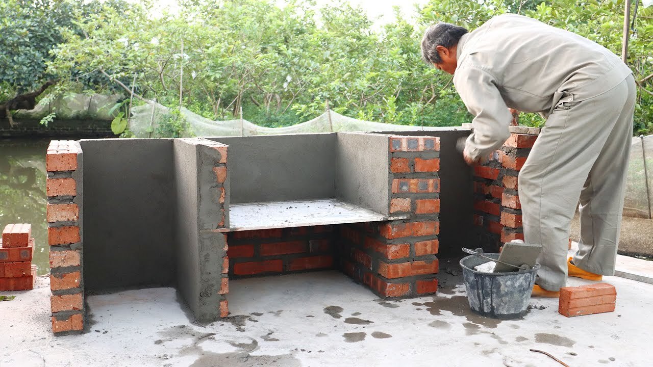
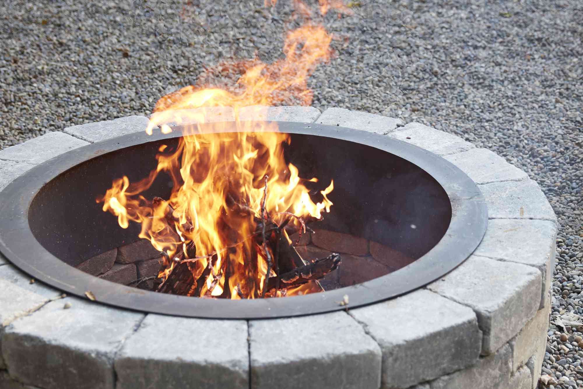
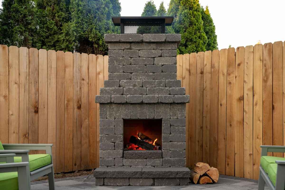
By: Evelyn Wilson • Firepits
How To Build A Fireplace
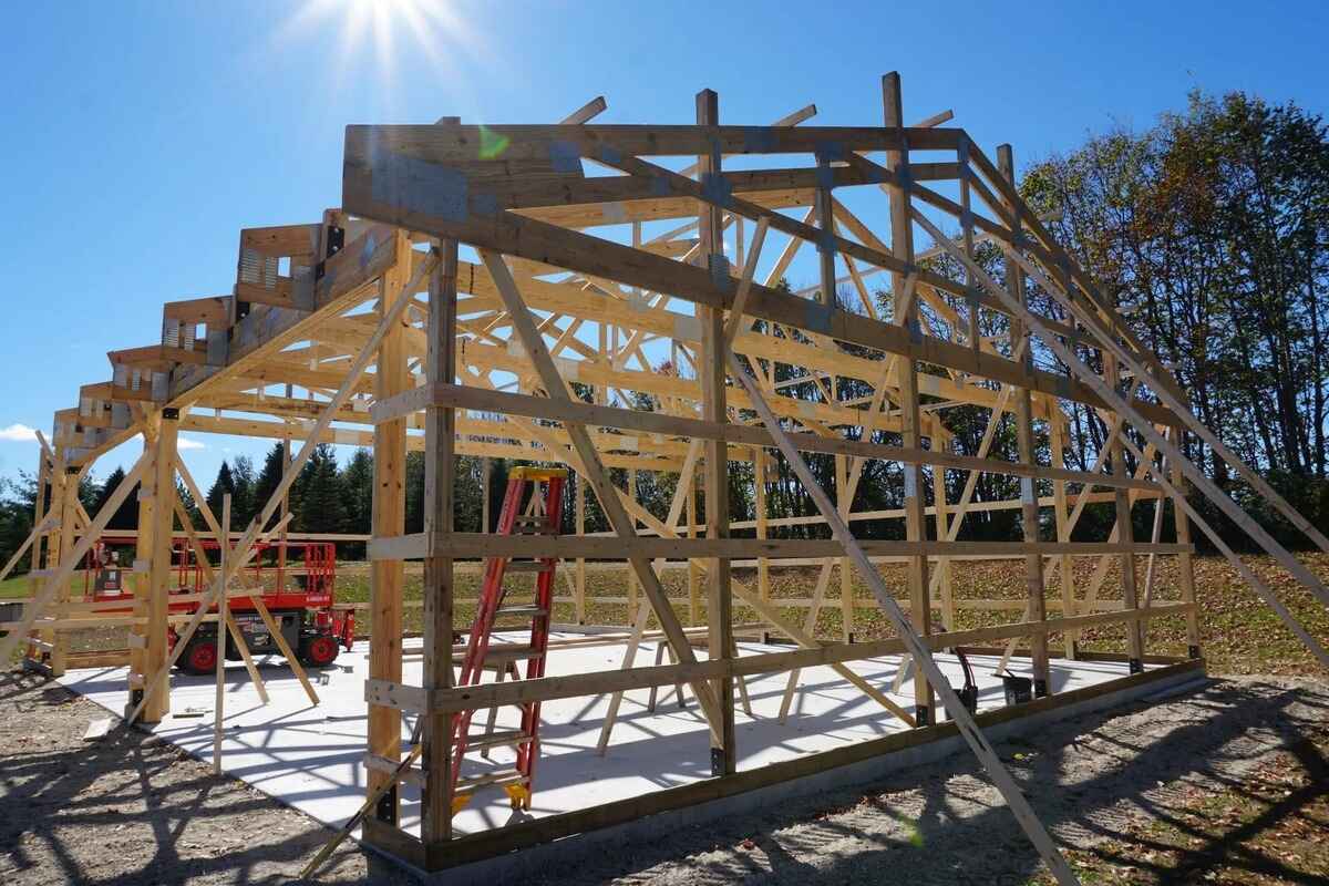
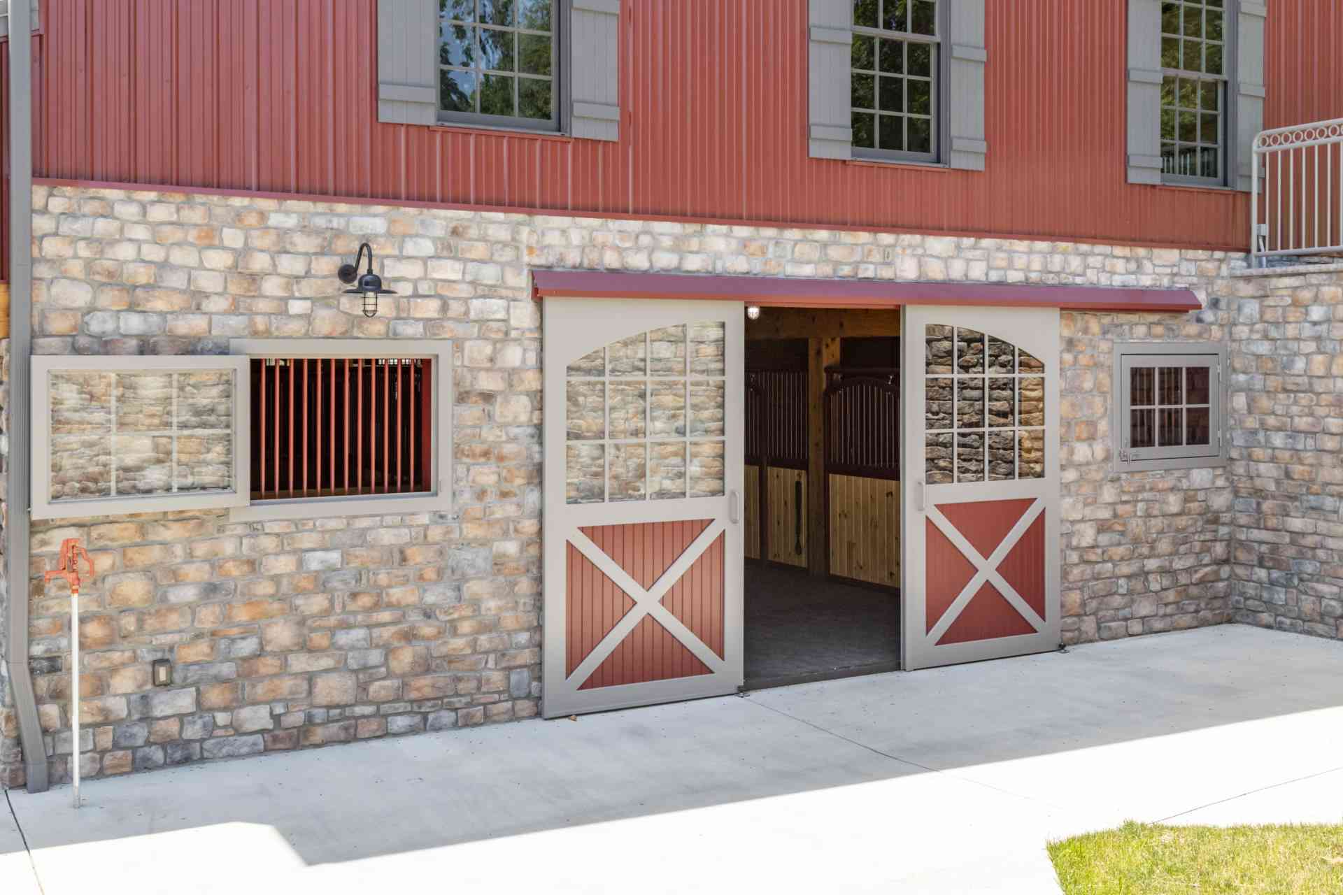
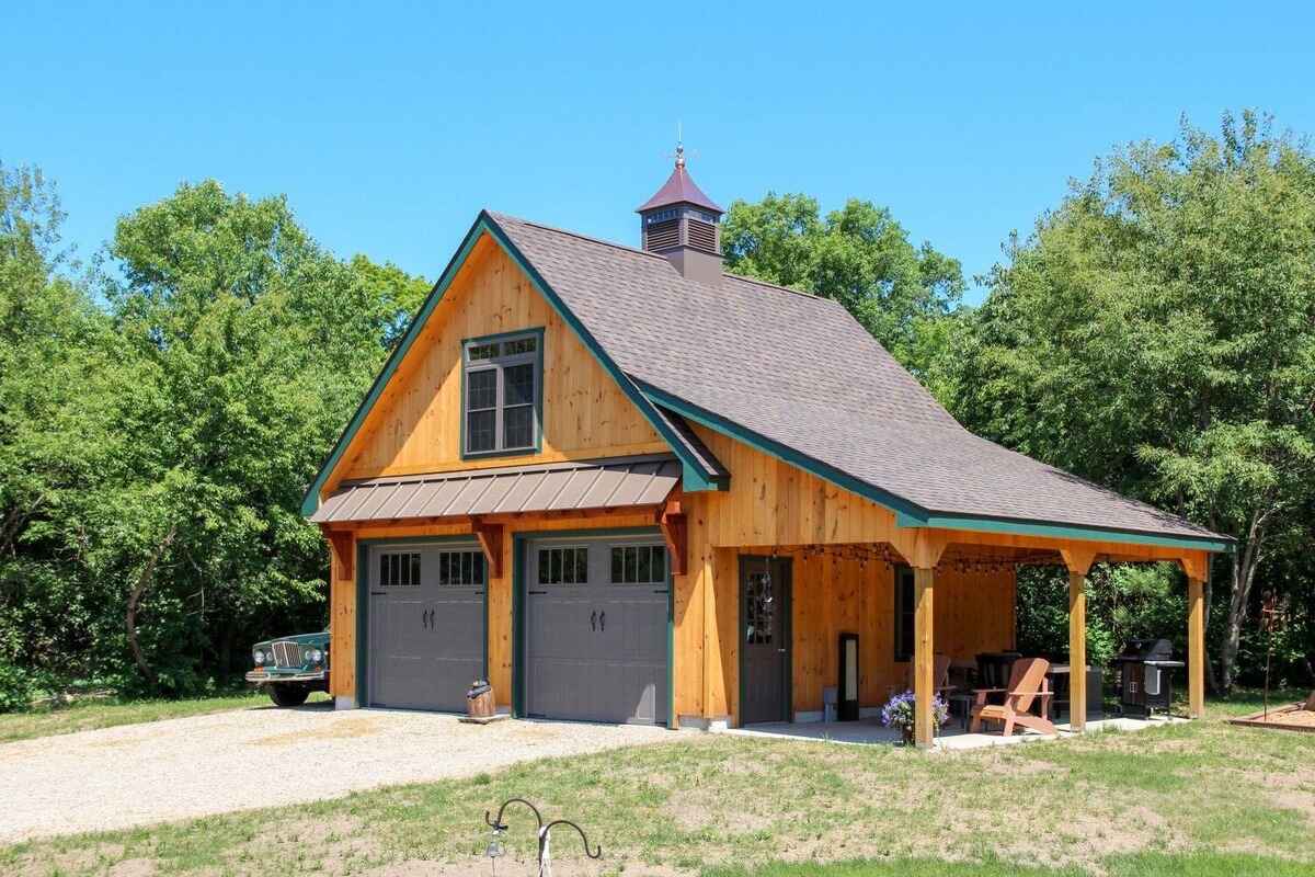
By: Evelyn Wilson • Garage & Basement
How To Build A Pole Barn
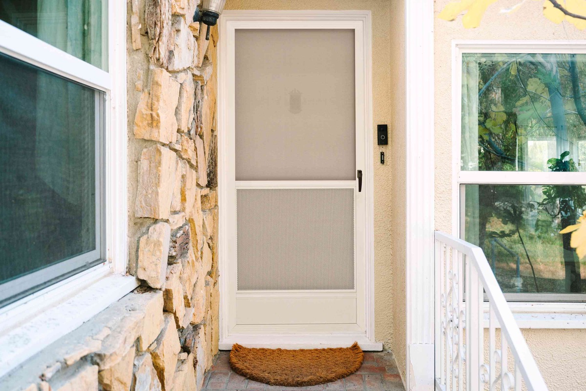
By: Evelyn Wilson • Doors & Windows
DIY Screen Door: Step-by-Step Guide To Building Your Own
By: Evelyn Wilson • DIY & Crafts